Credit: home-designing.com
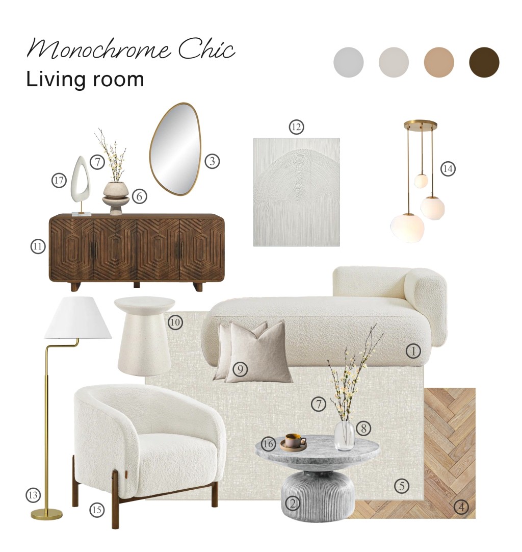
This Monochrome Chic Living Room demonstrates the power of a restrained palette. By combining creamy upholstery with rich wood elements and artistic accents, the space achieves visual interest through form and texture rather than color. The result is both serene and sophisticated, proving that a neutral space can make just as strong a statement as a colorful one.
Style: Modern Monochrome with Organic Elements
Color Combination: cream, warm white, rich brown, brass accents, light grey
Who is it for: Great for minimalists who appreciate quality over quantity, young professionals who entertain, or anyone who gets overwhelmed by too much color but still wants their space to feel vibrant. This layout works both as a complete living room or as a cozy conversation corner in a larger space – imagine it as your perfect “let’s catch up over coffee” spot in a spacious living area.
Budget: $$
Monochrome Chic Living Room shopping list
Below we present a curated list of products presented on the board:
Tips and suggestions
Colors That Work Together: The star here is that boucle fabric in warm white – it’s like wearing your favorite cozy sweater but in furniture form! We balanced all the light colors with that gorgeous dark wood sideboard, so the room feels grounded and intentional, not washed out.
Wall Details: That geometric art piece on the wall adds subtle movement and interest without overwhelming the space. It’s like adding just the right piece of jewelry to a simple outfit – it elevates everything without trying too hard.
Furniture Picks: We’re mixing curves with clean lines here – that chunky curved sofa paired with the structured accent chair creates interest without chaos. The wood pieces bring warmth through their rich color and geometric patterns.
Bringing Nature In: Those dried branches add height and movement without the maintenance of fresh flowers. They’re like nature’s sculpture – beautiful and zero maintenance!
Smart Lighting: We’ve got lighting at every level – the pendant cluster for drama, the floor lamp for reading, and that organic-shaped table lamp for ambiance. It’s like having perfect lighting for every mood.
Textures: This is where the magic happens. The boucle fabric, the textured wallpaper, the cement coffee table top, the woven rug – they’re all white or neutral but feel completely different. It’s like wearing all cream but mixing cashmere, linen, and silk.
The Final Note: This space proves that neutral design is anything but basic. By layering contrasting textures – like the plush boucle against sleek marble – and mixing organic curves with geometric patterns, we’ve created depth without relying on color. The key is in the details and feel free to play with them to create your own unique space.
Want to show us your take on this look? We’d love to see how you make it your own! Drop us a line at response@www.home-designing.com.
Share this story


